
Introduction
If you’re looking for a simple way to improve your online store’s appearance while increasing clicks on your product collections, a Shop Collection Side By Side layout is one of the best design choices available.
Instead of displaying collections in a long vertical list, this layout presents two featured collections next to each other. Visitors immediately notice multiple shopping categories, making navigation faster and encouraging them to explore more products.
Whether you’re using Shopify or WordPress, a responsive Shop Collection Side By Side section can significantly improve user experience, increase engagement, and boost conversion rates.
In this guide, you’ll learn:
- What Shop Collection Side By Side is
- Why it improves ecommerce performance
- Features of the provided HTML & CSS
- How to add it in Shopify
- How to add it in WordPress
- Customization ideas
- SEO best practices
- Common mistakes to avoid
What is Shop Collection Side By Side?
A Shop Collection Side By Side section is a responsive banner layout where two product collections appear beside each other.
Instead of using a slider, customers can instantly view multiple categories without waiting for animations.
Typical examples include:
| Left Collection | Right Collection |
|---|---|
| New Arrivals | Best Sellers |
| Men’s Fashion | Women’s Fashion |
| Summer Collection | Winter Collection |
| Electronics | Accessories |
| Furniture | Home Decor |
This layout works especially well on homepage sections.
Why Use Shop Collection Side By Side?
Modern ecommerce websites focus on reducing customer clicks.
When visitors immediately see multiple shopping options, they spend less time searching and more time shopping.
Some major advantages include:
- Better homepage organization
- Increased collection visibility
- Faster customer navigation
- Higher click-through rate
- Professional appearance
- Mobile responsiveness
- Easy customization
According to established usability guidance from the Nielsen Norman Group, users scan pages quickly rather than reading every element. Clear visual groupings and prominent categories help visitors find what they need faster.
Preview of the Layout

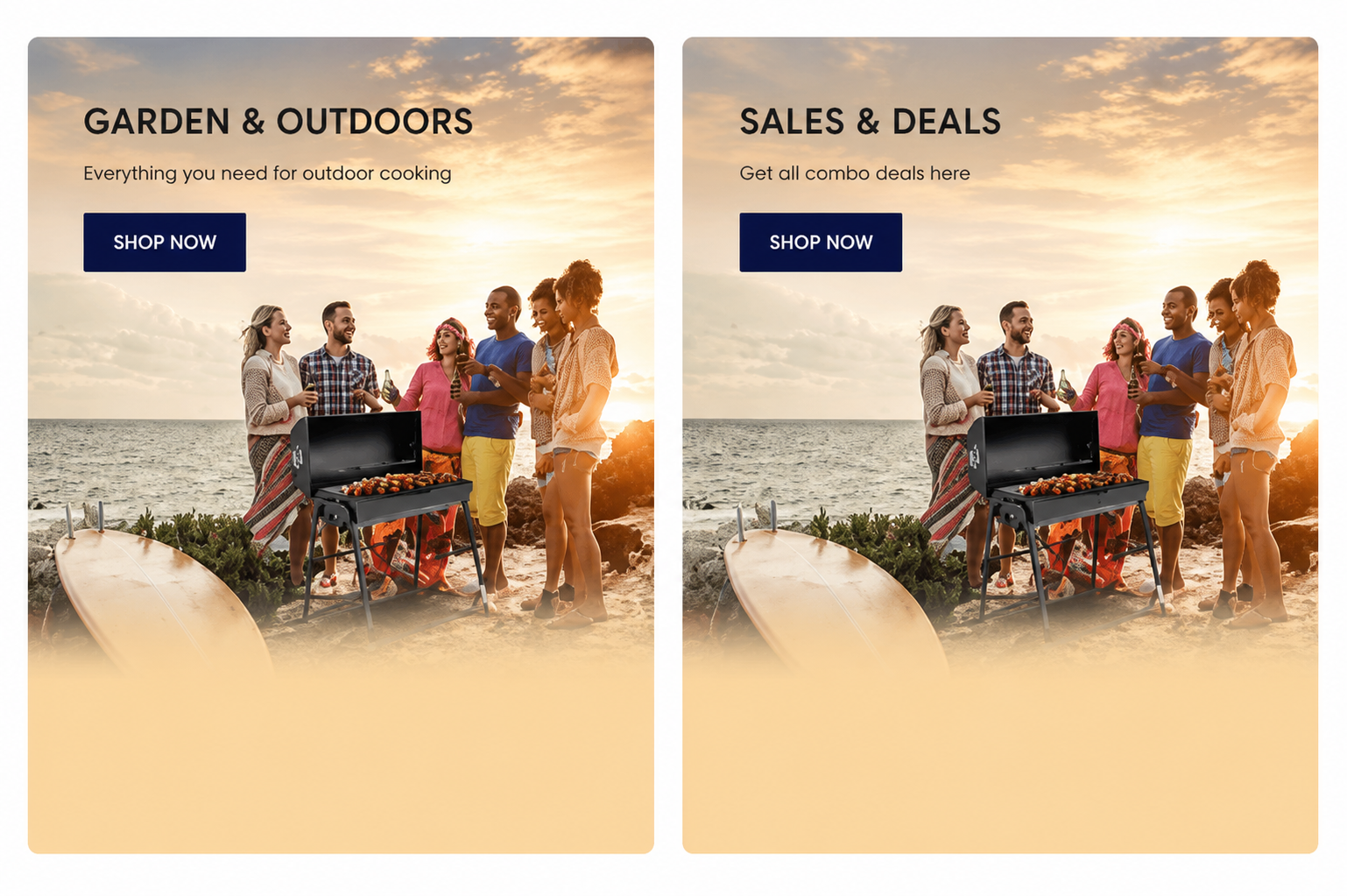
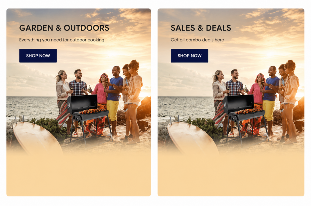
Your HTML creates two responsive promotional banners displayed in a CSS Grid
<!DOCTYPE html>
<html lang="en">
<head>
  <meta charset="UTF-8">
  <meta name="viewport" content="width=device-width, initial-scale=1.0">
  <title>Responsive Grid Banners</title>
  <style>
    * {
      box-sizing: border-box;
      margin: 0;
      padding: 0;
    }

    /* body {
      font-family: Arial, sans-serif;
      line-height: 1.6;
      background-color: #f4f4f4;
      color: #333;
    } */

    .container {
      display: grid;
      grid-template-columns: repeat(auto-fit, minmax(500px, 1fr));
      gap: 20px;
      max-width: 1200px;
      margin: 0 auto;
      padding: 20px;
    }

    .banner {
      position: relative;
      overflow: hidden;
      border-radius: 12px;
      transition: transform 0.3s;
      background: #fff;
    }

    .banner:hover {
      transform: scale(1.05);
    }

    .banner img {
      width: 100%;
      height: auto;
      display: block;
      transition: transform 0.3s;
    }

    .banner:hover img {
      transform: scale(1.0);
    }

    .content {
      position: absolute;
      top: 10%;
      left: 10%;
      color: white;
    }

    .content h2 {
      font-size: 2rem;
      margin-bottom: 10px;
      color: black;
    }

    .content p {
      font-size: 1.1rem;
      margin-bottom: 15px;
      color: black;
    }

    .btn {
      display: inline-block;
      padding: 10px 20px;
      background: #ffffff;
      color: #1e2d7d;
      text-decoration: none;
      font-weight: bold;
      border-radius: 4px;
      transition: background 0.3s;
    }

    .btn:hover {
      background: #1e2d7d;
      color: #ffffff;
    }

    @media (max-width: 1024px) {
      .container {
        grid-template-columns: 1fr;
      }

      .content {
        top: 15%;
        left: 5%;
      }

      .content h2 {
        font-size: 1.5rem;
      }

      .content p {
        font-size: 1rem;
      }

      .btn {
        padding: 8px 15px;
      }
    }
  </style>
</head>
<body>

<div class="container">
  <div class="banner">
    <img src="https://pengessentials.com/cdn/shop/files/Garden-outdoors-image_5_1.png?v=1655821719" alt="Garden & Outdoors">
    <div class="content">
      <h2>Garden & Outdoors</h2>
      <p>Everything you need for outdoor cooking</p>
      <a href="/collections/garden-and-outdoor" class="btn">Shop Now</a>
    </div>
  </div>

  <div class="banner">
    <img src="https://pengessentials.com/cdn/shop/files/Garden-outdoors-image_5_1.png?v=1655821719" alt="Sales & Deals">
    <div class="content">
      <h2>Sales & Deals</h2>
      <p>Get all combo deals here</p>
      <a href="/collections/combos" class="btn">Shop Now</a>
    </div>
  </div>
</div>

</body>
</html>
Each banner includes:
- Collection image
- Collection title
- Short description
- Shop Now button
- Hover animation
- Responsive layout
Desktop:
---------------------------------------------
| Garden & Outdoor | Sales & Deals          |
---------------------------------------------
Tablet:
-----------------------
| Garden & Outdoor    |
-----------------------
| Sales & Deals       |
-----------------------
Mobile:
-------------
Collection 1
-------------

-------------
Collection 2
-------------
Features of This Shop Collection Side By Side Design
Your provided code includes several modern ecommerce features.
| Feature | Benefit |
|---|---|
| CSS Grid | Clean responsive layout |
| Hover Animation | Better user interaction |
| Rounded Corners | Modern design |
| Responsive Images | Mobile friendly |
| CTA Buttons | Improves conversions |
| Lightweight CSS | Faster loading |
| Easy Customization | Beginner friendly |
Understanding the HTML Structure
The layout uses a simple structure.
Container

 ├── Banner
 │      ├── Image
 │      ├── Heading
 │      ├── Description
 │      └── Shop Button
 │
 └── Banner
        ├── Image
        ├── Heading
        ├── Description
        └── Shop Button
This clean structure makes editing extremely easy.
How the CSS Works
The CSS uses:
- CSS Grid
- Flexibility with
auto-fit - Responsive breakpoints
- Hover scaling
- Smooth transitions
- Absolute positioned text overlay
The most important line is:
grid-template-columns: repeat(auto-fit, minmax(500px, 1fr));This automatically adjusts columns depending on screen size.
How to Add Shop Collection Side By Side in Shopify
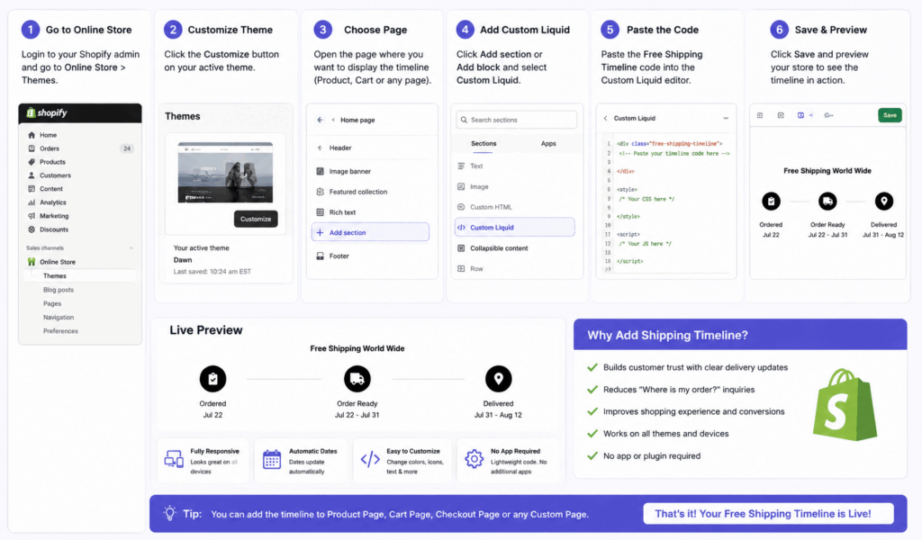
Adding this section to Shopify takes only a few minutes.
Step 1
Open
Online Store → Themes
Step 2
Click
Edit Code
Step 3
Create a new section.
Example:
collection-side-by-side.liquidStep 4
Paste the HTML.
Step 5
Move the CSS into:
assets/theme.cssor
base.cssStep 6
Save.
Step 7
Customize:
- Images
- Collection URLs
- Titles
- Buttons
How to Add Shop Collection Side By Side in WordPress
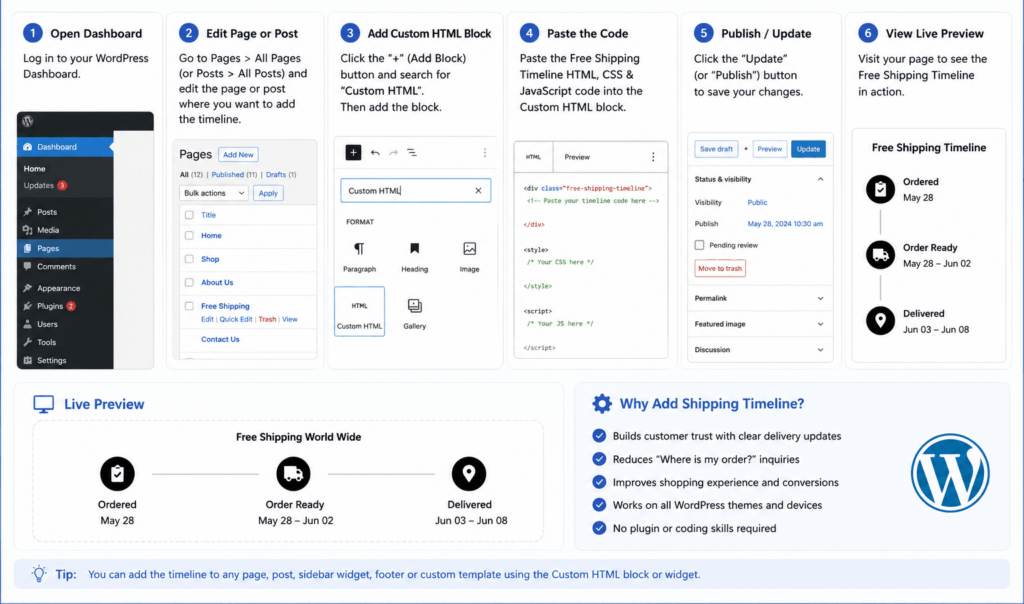
If you’re using WordPress:
Option 1
Use a Custom HTML Block.
Paste the HTML.
Option 2
Use Elementor HTML Widget.
Option 3
Insert into your theme template.
Option 4
Use a Code Snippets plugin for reusable sections.
Customization Ideas
You can personalize the design in many ways.
Change Background Images
Replace:
<img src="image-url">with your own banner.
Change Button Color
Example:
.btn{
background:#000;
color:#fff;
}
Add Overlay
.banner::before{
content:"";
position:absolute;
background:rgba(0,0,0,.3);
width:100%;
height:100%;
}
Add Animation
You can animate:
- Fade
- Zoom
- Slide
- Bounce
- Rotate
using CSS transitions.
Best Image Size
For best quality:
| Device | Recommended Size |
|---|---|
| Desktop | 1200 × 700 px |
| Tablet | 900 × 600 px |
| Mobile | 700 × 900 px |
Use compressed WebP images for faster loading.
SEO Benefits of Shop Collection Side By Side
Besides improving design, this layout supports SEO by:
- Highlighting important collections
- Improving internal linking
- Reducing bounce rate
- Enhancing user engagement
- Encouraging deeper site exploration
Optimize each image with descriptive alt text, such as “Shop Collection Side By Side – Garden & Outdoors Banner”, to improve accessibility and image search visibility.
Performance Tips
Keep the section lightweight.
✔ Compress images
✔ Use lazy loading
✔ Minify CSS
✔ Optimize fonts
✔ Use WebP images
✔ Avoid oversized banners
Common Mistakes to Avoid
Many beginners make these mistakes:
❌ Large image files
❌ Too much text
❌ Poor mobile spacing
❌ Small buttons
❌ Low contrast text
❌ Broken collection links
❌ Missing alt text
Fixing these improves both usability and SEO.
Comparison: Side By Side vs Slider
| Feature | Side By Side | Slider |
|---|---|---|
| Loads Faster | ✅ | ❌ |
| Better UX | ✅ | ⚠️ Depends |
| SEO Friendly | ✅ | Moderate |
| Mobile Friendly | ✅ | Often Less Effective |
| Easy Navigation | ✅ | Requires Interaction |
| Shows Multiple Collections | ✅ | Usually One at a Time |
Best Use Cases
A Shop Collection Side By Side section works well for:
- Fashion stores
- Furniture websites
- Electronics shops
- Grocery stores
- Cosmetics brands
- Jewelry stores
- Pet stores
- Home décor stores
- Shopify stores
- WooCommerce websites
Recommended Enhancements
Take your section to the next level by adding:
- Countdown timer
- Sale badges
- Collection labels
- Hover effects
- Video backgrounds
- Gradient overlays
- Dark mode support
- Scroll animations
- Dynamic collection loading
Internal Linking Ideas
To strengthen your website’s SEO, link this article to related tutorials, such as:
- Responsive Collection Grid
- Shopify Homepage Customization
- WordPress Banner Section
- CSS Grid Layout Tutorial
- Image Optimization Guide
- Responsive HTML Templates
Suggested Images for This Blog
Include these visuals throughout the article:
- Hero banner showing two collections side by side.
- Screenshot of the HTML structure.
- Responsive desktop, tablet, and mobile preview.
- Shopify theme editor with the section added.
- WordPress Custom HTML block example.
- Before-and-after comparison of a homepage using the layout.
Use the focus keyword in the main image’s alt text: “Shop Collection Side By Side”.
Conclusion
A Shop Collection Side By Side layout is a simple yet powerful way to showcase featured categories and improve the shopping experience. By presenting two collections together, you make navigation more intuitive, highlight key products, and create a modern homepage that works well across desktop and mobile devices.
The HTML and CSS example you’ve shared is lightweight, responsive, and easy to customize for both Shopify and WordPress. With optimized images, clear calls to action, and thoughtful styling, this section can help increase engagement and support your store’s overall SEO strategy.
Frequently Asked Questions
Is this layout mobile responsive?
Yes. The CSS Grid automatically stacks the banners into a single column on smaller screens.
Can I use more than two collections?
Yes. Add more .banner elements inside the .container, and the grid will adapt automatically.
Does it work with Shopify 2.0 themes?
Yes. You can add it as a custom Liquid section or embed it in an existing section.
Is it compatible with WordPress page builders?
Yes. It works with Gutenberg, Elementor, WPBakery, and most page builders that support custom HTML.
Can I replace the images with videos?
Yes. You can use HTML5 <video> elements instead of <img> if you want animated collection banners