
How to Create Banner in Shopify and WordPress
Introduction
The first thing visitors notice when they land on your website isn’t your product description or pricing—it’s your banner.
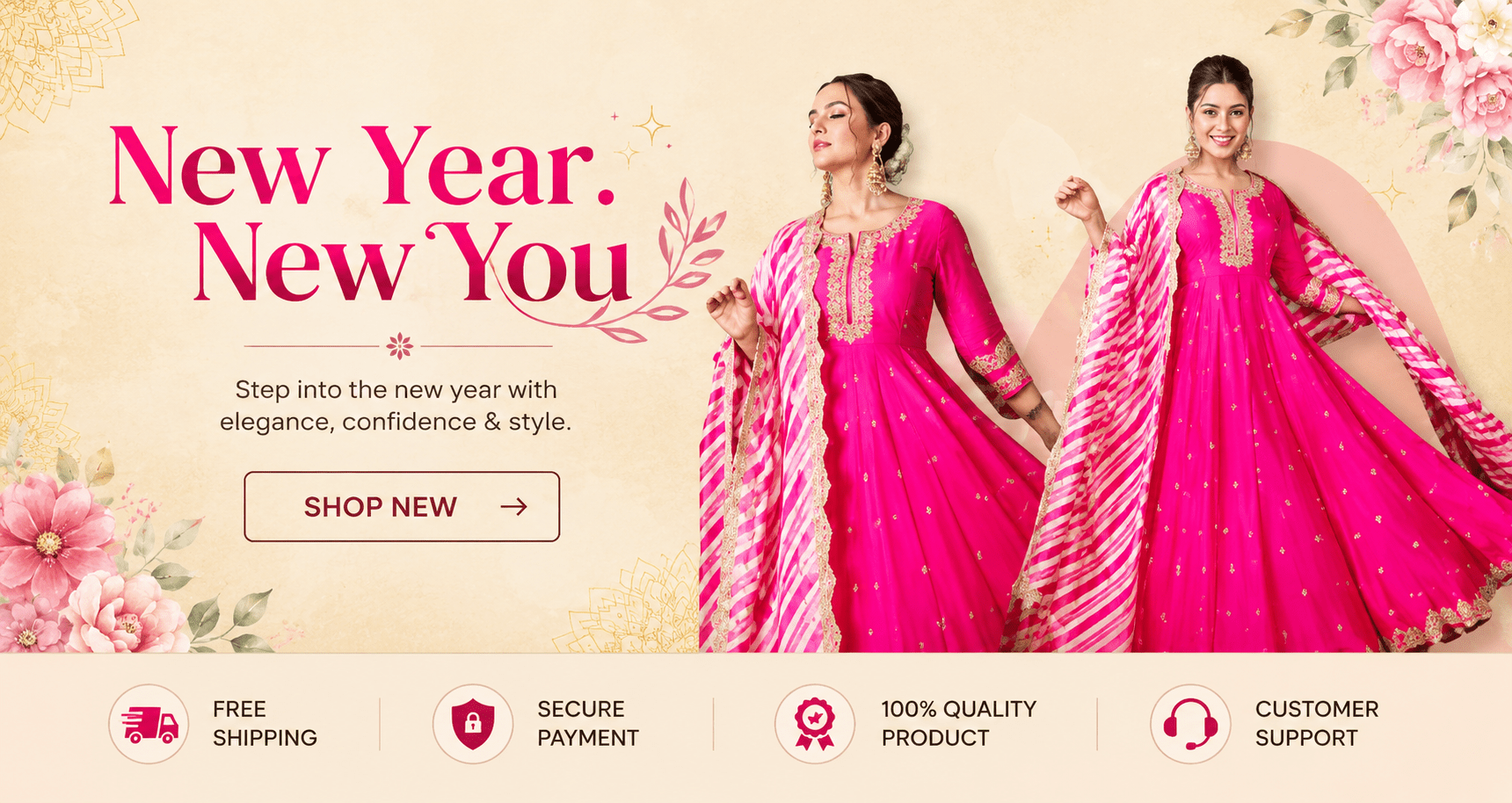
A professionally designed banner immediately communicates your brand, showcases promotions, and guides customers toward taking action. Whether you’re launching a new collection, announcing a seasonal sale, or highlighting featured products, knowing How to Create Banner correctly can significantly improve user engagement and conversions.
The good news is that creating a responsive banner doesn’t require expensive apps or complex coding. With a simple HTML structure and a few lines of CSS, you can build a fast-loading, mobile-friendly banner that works beautifully in both Shopify and WordPress.
In this guide, you’ll learn how to create a full-width responsive banner, understand design best practices, optimize it for SEO, and implement it using the code you provided.
Why Every E-commerce Store Needs a Banner
A website banner is much more than a decorative image.
It serves several important purposes:
- Introduces visitors to your latest collection
- Promotes discounts and seasonal campaigns
- Highlights new arrivals
- Reinforces your brand identity
- Directs users to important pages
- Improves click-through rate (CTR)
For fashion stores, electronics, beauty brands, or home décor websites, the homepage banner often acts as a digital storefront.
When designed properly, it can immediately answer the visitor’s question:
“Why should I shop here?”
What is a Full-Width Banner?
A full-width banner stretches across the entire browser window regardless of screen size.
Unlike boxed layouts, it creates a modern and immersive appearance.
Example:
-----------------------------------------
|                                       |
|         Promotional Banner            |
|                                       |
-----------------------------------------
It works exceptionally well for:
- Hero sections
- Sale announcements
- Collection launches
- Product showcases
- Seasonal campaigns
Benefits of Using Responsive Banners
| Traditional Banner | Responsive Banner |
|---|---|
| Fixed size | Automatically adjusts |
| Poor mobile experience | Mobile-friendly |
| Can appear stretched | Maintains proportions |
| Lower engagement | Better visual impact |
| Difficult to manage | Easy to update |
Responsive banners ensure your website looks professional across desktops, tablets, and smartphones.
Understanding Your HTML Structure

Your supplied code is intentionally simple:
<div class="full-width-banner">
  <img src="https://cdn.shopify.com/s/files/1/0912/3312/4632/files/product_webbanner_1.png?v=1737353691" alt="Product Web Banner" class="full-banner-image">
</div>

<style>
  .full-width-banner {
    width: 100%;
    margin: 0;
    padding: 0;
    overflow: hidden; /* Prevents accidental overflow */
  }
  .full-banner-image {
    width: 100%;
    height: auto; /* Maintains aspect ratio */
    display: block; /* Removes any extra spacing below the image */
  }
</style>
<div class="full-width-banner">
<img src="banner-image.png" class="full-banner-image">
</div>The wrapper acts as the container.
The image fills the container.
Everything else is handled by CSS.
This simplicity is one reason the design loads quickly and is easy to maintain.
CSS Explained
Your CSS:
.full-width-banner{
    width:100%;
    overflow:hidden;
}

.full-banner-image{
    width:100%;
    height:auto;
    display:block;
}
Each property has an important role.
width:100%
Makes the banner stretch across the available width.
height:auto
Keeps the image proportional.
Without it, images may become distorted.
display:block
Removes the small white gap that browsers leave below inline images.
overflow:hidden
Ensures nothing extends outside the banner area.
How to Create Banner in Shopify
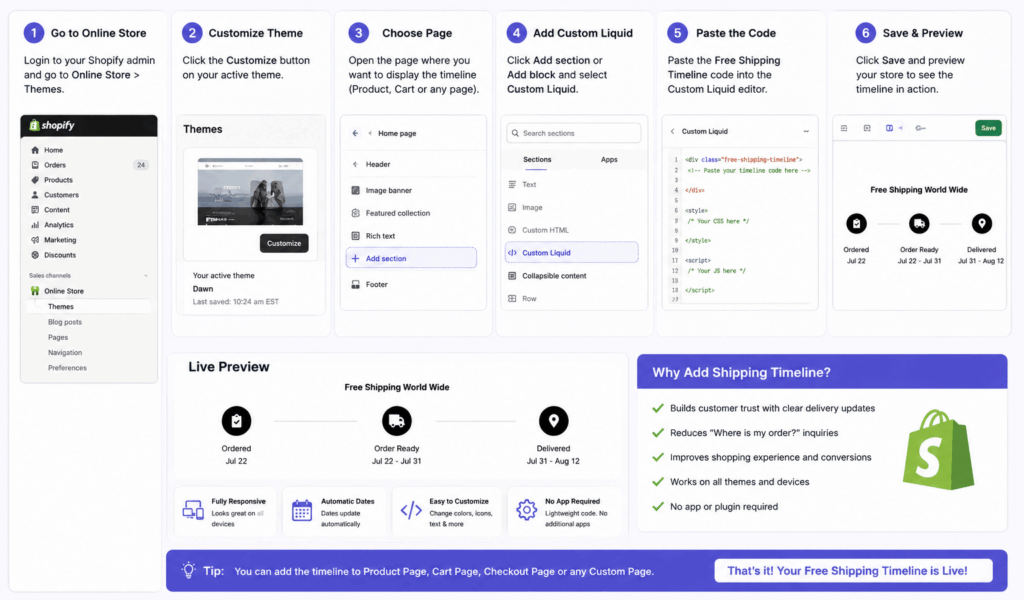
Shopify makes banner implementation straightforward.
Method 1: Custom Liquid
Navigate to:
Online Store
↓
Themes
↓
Customize
↓
Add Section
↓
Custom Liquid
Paste your HTML.
Upload your banner image to Content → Files and replace the image URL.
Method 2: Theme Code
For permanent implementation:
Online Store
↓
Themes
↓
Edit Code
Create a new section:
banner.liquidInsert:
<div class="full-width-banner">

<img
src="{{ 'banner.jpg' | asset_url }}"
class="full-banner-image"
alt="Banner">

</div>
Then add the CSS to your theme stylesheet.
How to Create Banner in WordPress
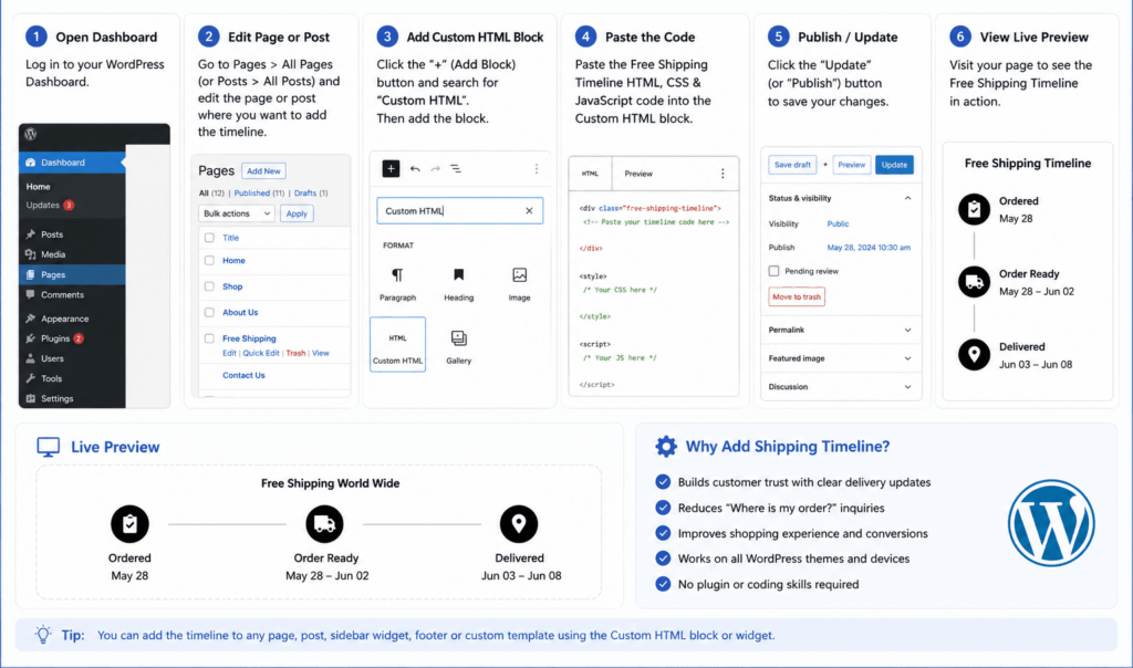
WordPress offers multiple implementation methods.
Custom HTML Block
Simply paste:
<div class="full-width-banner">

<img
src="banner.jpg"
class="full-banner-image">

</div>
Then place the CSS in:
Appearance
↓

Customize

↓

Additional CSS
or inside your child theme.
Elementor
If using Elementor:
- Add an HTML widget
- Paste the code
- Add CSS in Custom CSS
No plugin is required.
Making the Banner Clickable
Many store owners forget this.
Your banner should usually direct visitors somewhere.
Example:
<a href="/collections/new-arrivals">

<img src="banner.jpg">

</a>
Now the banner becomes a promotional call-to-action.
Adding Text Over the Banner
Instead of editing text inside Photoshop every time, place text using HTML.
Example:
<div class="banner">

<img src="banner.jpg">

<div class="banner-content">

<h2>Summer Sale</h2>

<p>Up to 50% OFF</p>

<a href="#">Shop Now</a>

</div>

</div>
Advantages:
- Better SEO
- Faster updates
- Better accessibility
- Dynamic promotions
Best Banner Sizes
| Purpose | Recommended Size |
|---|---|
| Homepage Hero | 1920 × 700 px |
| Collection Banner | 1920 × 500 px |
| Product Banner | 1600 × 600 px |
| Blog Banner | 1200 × 630 px |
| Mobile Banner | 1080 × 1350 px |
Banner Design Tips
A great banner isn’t just attractive—it communicates clearly.
Keep these best practices in mind:
Use High-Quality Images
Blurry images reduce trust.
Use optimized JPEG or WebP files for faster loading.
Limit Text
Instead of:
“Welcome to our amazing fashion collection where you’ll find…”
Use:
NEW ARRIVALS
Shop Now
Simple messaging performs better.
Use Contrast
Ensure text remains readable.
Dark overlay:
background:
rgba(0,0,0,.4);
can dramatically improve readability.
Focus on One CTA
Avoid multiple competing buttons.
Instead:
✓ Shop Now
or
✓ Explore Collection
Shopify vs WordPress Banner Comparison
| Feature | Shopify | WordPress |
|---|---|---|
| Easy Setup | ⭐⭐⭐⭐⭐ | ⭐⭐⭐⭐ |
| Custom Coding | Excellent | Excellent |
| Theme Integration | Native | Depends on Theme |
| Dynamic Sections | Yes | Via Builder |
| Mobile Friendly | Yes | Yes |
| Performance | Excellent | Excellent |
SEO Best Practices
When learning How to Create Banner, don’t overlook SEO.
Use Descriptive Alt Text
Instead of:
banner.jpgUse:
Women's Summer Collection BannerSearch engines cannot interpret images like humans.
Alt text helps improve accessibility and image search visibility.
Compress Images
Large images slow websites.
Aim for:
- Under 300 KB
- WebP format when possible
Google recommends optimizing images to improve page speed and user experience.
Use Lazy Loading
Example:
<img
loading="lazy">
This improves performance, especially below-the-fold images.
Common Mistakes
Avoid these common errors:
❌ Huge 5 MB images
❌ Stretching images
❌ Too much text
❌ No CTA
❌ No alt text
❌ Tiny mobile fonts
❌ Poor contrast