
Introduction: Turn Your Store’s Best Selling Points Into a Visual Trust Strip
Customers rarely read an entire e-commerce page before deciding whether a store feels trustworthy. They scan.
That makes small messages such as Free Shipping, Secure Payment, 100% Quality Product, and Customer Support surprisingly important. But displaying those benefits as another paragraph doesn’t give them much visual weight.
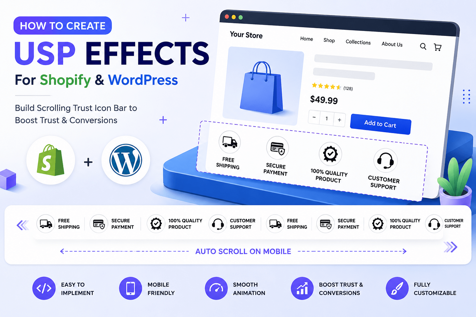
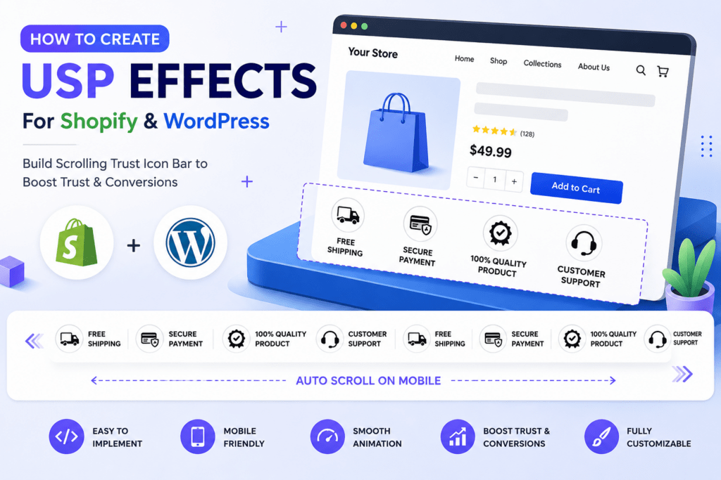
A better approach is a USP effects section: a horizontal row of icons and short selling points that stays static on desktop but can automatically scroll on smaller screens.
If you’re searching for How to Create a USP Effects for Shopify or WordPress, this guide shows you how to build the effect using lightweight HTML and CSS—without depending on a slider plugin.
We’ll also improve the original implementation so that the animation is smoother, easier to maintain, and more accessibility-conscious.
What Is a USP Effects Section?
USP stands for Unique Selling Proposition or Unique Selling Point.
On an online store, a USP section quickly communicates reasons customers should feel comfortable buying from you.
Common examples include:
- 🚚 Free Shipping
- 🔒 Secure Payment
- ✓ 100% Quality Product
- 🎧 Customer Support
Instead of displaying these messages as plain text, we combine an icon and short label.
On desktop, they might appear as:
FREE SHIPPING | SECURE PAYMENT | 100% QUALITY PRODUCT | CUSTOMER SUPPORT
On mobile, the same items can continuously move horizontally.
This creates a compact USP marquee or scrolling trust-badge effect.
Why USP Effects Work Well on E-Commerce Websites
The strongest reason to use this component isn’t animation.
It’s information hierarchy.
Shipping, payment security, product quality, and customer support are important, but they shouldn’t compete visually with your product image, title, price, or Add to Cart button.
A compact icon strip creates a second level of information.
| Element | Plain Text | USP Icon Strip |
|---|---|---|
| Free Shipping | Easy to overlook | Highly scannable |
| Secure Payment | Takes text space | Compact |
| Quality Promise | Blends into content | Visually distinct |
| Customer Support | Often buried | Immediately visible |
| Mobile layout | Can become long | Horizontal |
| Visual impact | Low | High |
| Animation | None | Optional |
This is why I prefer treating the USP strip as a supporting conversion component, not as the hero of the page.
If everything moves, nothing feels important.

FREE
SHIPPING

SECURE PAYMENT

100% QUALITY PRODUCT

CUSTOMER SUPPORT
FREE
SHIPPING
SECURE PAYMENT
100% QUALITY PRODUCT
CUSTOMER SUPPORT
<div class="features-wrapper">
  <div class="features-container">
    <div class="feature-item">
      <img src="https://cdn.shopify.com/s/files/1/0721/0886/7822/files/freeshipping.png?v=1736404873" alt="FREE SHIPPING">
      <p>FREE<br>SHIPPING</p>
    </div>
    <div class="feature-item">
      <img src="https://cdn.shopify.com/s/files/1/0721/0886/7822/files/secure_payment.png?v=1736404873" alt="Secure Payment">
      <p>SECURE PAYMENT</p>
    </div>
    <div class="feature-item">
      <img src="https://cdn.shopify.com/s/files/1/0721/0886/7822/files/high_quality.png?v=1736404873" alt="100% QUALITY PRODUCT">
      <p>100% QUALITY PRODUCT</p>
    </div>
    <div class="feature-item">
      <img src="https://cdn.shopify.com/s/files/1/0721/0886/7822/files/customer_support.png?v=1736404873" alt="CUSTOMER SUPPORT">
      <p>CUSTOMER SUPPORT</p>
    </div>
    <!-- Duplicated items for continuous scrolling -->
    <div class="feature-item">
      <img src="https://cdn.shopify.com/s/files/1/0721/0886/7822/files/freeshipping.png?v=1736404873" alt="FREE SHIPPING">
      <p>FREE<br>SHIPPING</p>
    </div>
    <div class="feature-item">
      <img src="https://cdn.shopify.com/s/files/1/0721/0886/7822/files/secure_payment.png?v=1736404873" alt="Secure Payment">
      <p>SECURE PAYMENT</p>
    </div>
    <div class="feature-item">
      <img src="https://cdn.shopify.com/s/files/1/0721/0886/7822/files/high_quality.png?v=1736404873" alt="100% QUALITY PRODUCT">
      <p>100% QUALITY PRODUCT</p>
    </div>
    <div class="feature-item">
      <img src="https://cdn.shopify.com/s/files/1/0721/0886/7822/files/customer_support.png?v=1736404873" alt="CUSTOMER SUPPORT">
      <p>CUSTOMER SUPPORT</p>
    </div>
  </div>
</div>

<style>
  /* Wrapper to hide overflow */
  .features-wrapper {
    overflow: hidden;
    width: 100%;
    background-color: #f9f9f9;
    font-family: 'DM Sans', sans-serif;
  }

  /* Scrolling container */
  .features-container {
    display: flex;
    justify-content: center; /* Center the items on desktop */
    flex-wrap: nowrap;
    transition: transform 0.3s ease-in-out;
  }

  /* Individual feature items */
  .feature-item {
    text-align: center;
    width: 120px;
    flex: 0 0 auto;
    margin: 0 20px; /* Normal space between items */
  }

  .feature-item img {
    width: 50px;
    height: 50px;
    margin-bottom: 5px;
    transition: opacity 0.3s;
  }

  .feature-item p {
    font-size: 14px;
    font-weight: bold;
    margin: 0;
    transition: color 0.3s;
  }

  /* Hover effect for images and text */
  .feature-item:hover img {
    opacity: 0.8;
  }

  .feature-item:hover p {
    color: #1a6940;
  }

  /* Mobile-specific styles */
  @media (max-width: 768px) {
    .features-container {
      animation: scroll 20s linear infinite; /* Mobile scrolling effect */
      gap: 10px; /* Reduces space between items on mobile */
    }

    .feature-item {
      margin: 0 10px; /* Normal spacing on mobile */
      width: 80px; /* Adjust width for better fit */
    }

    /* Ensure items don't wrap on mobile */
    .features-container {
      flex-wrap: nowrap;
    }
  }

  /* Keyframes for auto-scrolling on mobile */
  @keyframes scroll {
    0% {
      transform: translateX(0);
    }
    100% {
      transform: translateX(-50%); /* Scroll across all items, making it repeat */
    }
  }
</style>
How to Create a USP Effects in Shopify
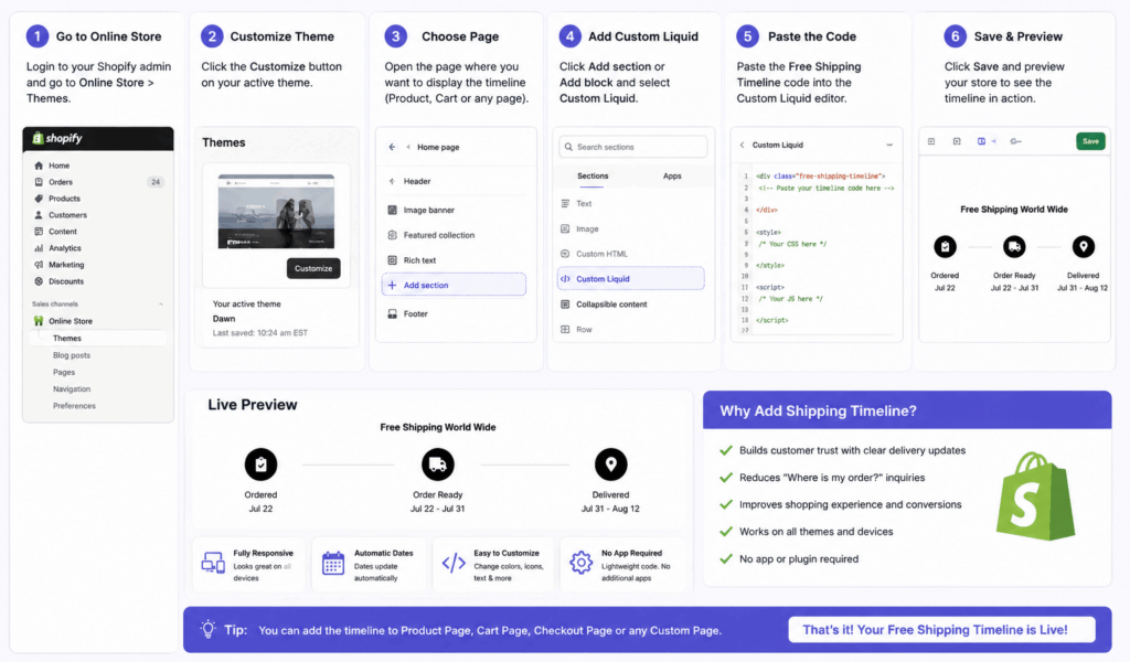
Shopify is an excellent platform for this type of section because the feature can eventually be converted into a customizable Shopify section.
Shopify’s current theme architecture uses Liquid for generated markup and supports CSS and JavaScript for theme functionality. Its sections are reusable modules, and sections can contain blocks that merchants can add, remove, and reorder.
Shopify Theme Architecture Documentation
Quick Shopify Method
From your Shopify admin:
Online Store → Themes → Edit code
Depending on your theme, you can add the component to an appropriate section/snippet or create a dedicated Liquid section.
For testing, you can also use a Custom Liquid section if your theme provides one.
Your image URLs can use Shopify CDN-hosted files, as in your supplied code.
Better Shopify Approach: Make Each USP Editable
Hard-coding four benefits works, but there’s a major disadvantage.
Every time you want to replace Free Shipping with Easy Returns, you need to edit code.
A better long-term Shopify implementation turns every USP into a block.
For example, each block could have:
{{ block.settings.icon }}
{{ block.settings.title }}
Then your merchant-facing Theme Editor could conceptually contain:
USP / Trust Bar
- Free Shipping
- Secure Payment
- 100% Quality Product
- Customer Support
- Add Block
Shopify explicitly supports reusable and reorderable blocks within sections, which makes this architecture much easier to maintain than hard-coded USP items.
This is the version I’d choose for a production store.
How to Create a USP Effects in WordPress
The front-end concept is essentially identical in WordPress.
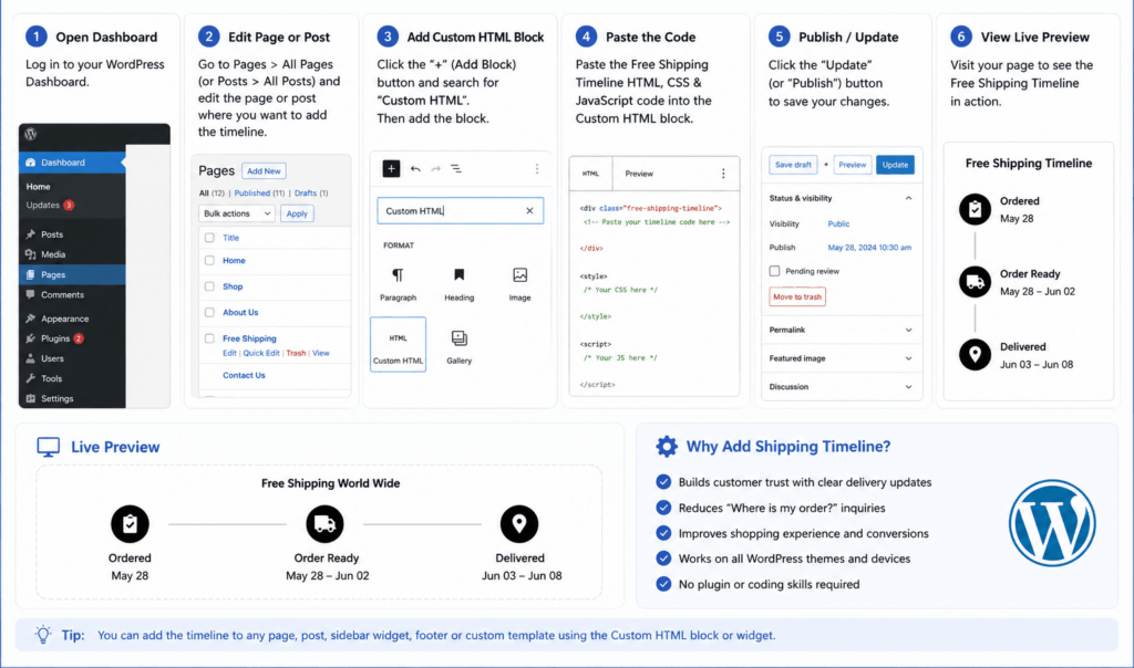
You need:
HTML → USP items
CSS → Design
CSS animation → Scrolling effect
Depending on your WordPress setup, the HTML can be placed through a suitable custom HTML/code area, theme template, child theme, or page-builder HTML component.
The important point is that the visual effect doesn’t depend on Shopify Liquid.
The core component is ordinary HTML and CSS.
That means the same USP design can be recreated in:
- WordPress
- WooCommerce
- Elementor-based layouts
- Gutenberg/block-based sites
- Custom WordPress themes
Only the method for managing the content changes.
Desktop vs Mobile USP Strategy
One of the best decisions in your original implementation is not forcing the same behavior everywhere.
| Feature | Desktop | Mobile |
|---|---|---|
| Layout | Centered row | Horizontal track |
| Animation | Static | Continuous |
| Icon size | 48–50px | 40–48px |
| Item width | 120–140px | 80–100px |
| Spacing | Generous | Compact |
| Primary goal | Trust visibility | Space efficiency |
A desktop screen already has enough horizontal space.
Making the icons constantly move there can actually make the page feel busier.
Mobile is different. Horizontal movement lets you preserve readable icons and labels without consuming excessive vertical space.
That’s responsive design based on behavior, not merely screen size.
Where Should You Place the USP Section?
Placement matters almost as much as design.
For e-commerce websites, useful positions include directly below the header, around the product information area, below the Add to Cart area, or before the footer.
On a product page, I particularly like placing trust benefits near the purchase area.
A shopper thinking:
“How much is shipping?”
shouldn’t need to reach the footer to discover:
FREE SHIPPING
Likewise, a clear SECURE PAYMENT message is more relevant near the buying decision than halfway through an About Us page.
Common Mistakes to Avoid
The first is adding too many USPs. Four to six strong benefits are usually easier to scan than ten weak ones.
Second, avoid vague claims. “Best Service” communicates less than “Customer Support.” “Amazing Delivery” communicates less than “Free Shipping.”
Third, don’t make icons too large. They support the message rather than replace your products as the visual focus.
Fourth, don’t make the animation too fast. Customers need enough time to recognize the icon and read the label.
Finally, test the loop on real mobile widths. A translateX(-50%) marquee works best when the two halves are genuinely identical in dimensions and spacing.
Key Insights: Build a Trust Component, Not Just an Animation
The biggest lesson from creating this component is that USP effects are primarily about communication.
The scrolling animation is secondary.
A strong implementation follows this hierarchy:
Clear Benefit → Recognizable Icon → Short Label → Appropriate Placement → Subtle Motion
If your customers immediately understand:
Free Shipping
Secure Payment
Quality Product
Customer Support
then the component is doing its job.
The animation simply helps present those benefits efficiently on narrow screens.